Handbuch TYPO3
Inhaltsverzeichnis
- Introduction
- The Backend
- Working with pages
-
Working with content elements
- What is a content element?
- Symbols in the content area
- Add content elements
- Copy content elements
- Cut out content elements
- Hide content elements
- Delete content elements
- Text & Media
- Accordion
- Text teaser without icon
- Link list
- List of downloads/materials
- Facts module
- Teaser
- Stage slider
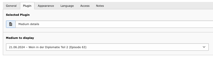
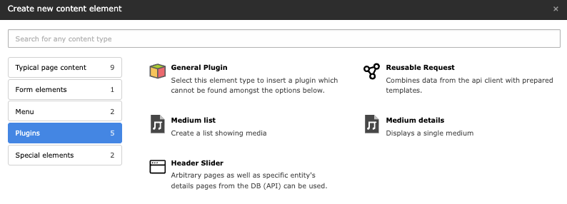
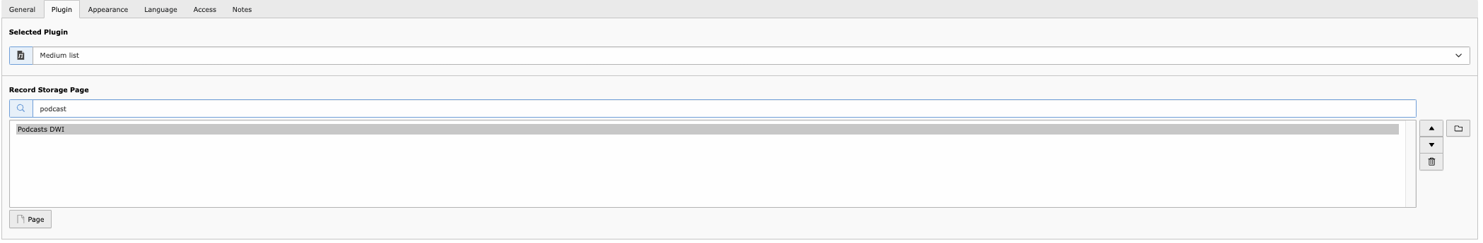
- Podcast
- Podcast list
Introduction
This manual provides a general introduction to the use of the TYPO3 content management system (CMS) for editors. The first chapters describe TYPO3 version 12 independently of the project, while the subsequent chapters refer to project-specific features. In the last chapter, Glossary, you will find an overview of the most common symbols and their meaning in the backend.
(Kopie 2)
The manual is designed as a reference work to answer specific questions for the editor. For this reason, there are duplications in some places that would not be necessary if the handbook were worked through chronologically.
What is TYPO3?
TYPO3 is an open source content management system. Open source means that the source code is freely available to everyone and can be modified by anyone for their own purposes. TYPO3 is mainly written in the PHP programming language. Development was started in 1997 by Kasper Skårhøj and has been driven forward as an open source project by many developers since 2001. The current long-term support version is TYPO3 12.4 LTS.
The terms "backend" and "frontend"
The term “backend” refers to the user interface in which various tasks for configuring the website can be carried out. This includes, for example, creating, editing and deleting individual pages or adding images and various content elements. The term “frontend”, on the other hand, refers to the website itself. In other words, what the visitor sees when they access a particular page.
Cache
TYPO3 uses various caches. Caches are temporary memories that store certain data, as otherwise a recalculation would be necessary every time the page is used. For example, the content of a particular page is cached to prevent the need to recalculate what content the page should display for each new visitor. It may therefore sometimes be necessary to clear the frontend cache so that a change to the content elements is also displayed.
The Backend
Login
Access to the TYPO3 backend is restricted by a login mask. You can access this by adding /typo3 to the full address of the website (e.g. www.beispiel-webseite.de). So: 'www.beispiel-webseite.de/typo3. To log in, simply click on the Log in to backend button in the login mask.
Overview
The header bar at the top right of the backend is used for quick access to some important functions of the TYPO3 backend, regardless of which module you are currently in.
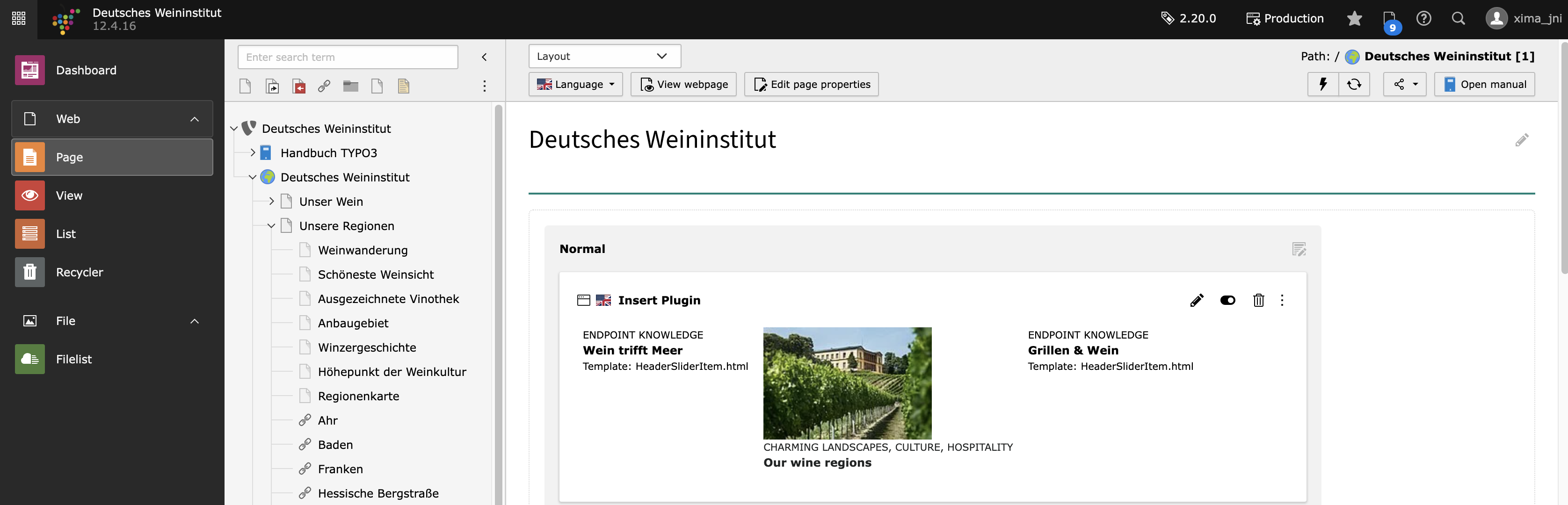
The module list is located on the left-hand side of the backend. The desired workspace is selected here. The modules are divided into main and sub-modules.
The navigation bar is located to the right of the module bar. It mainly shows the page tree of the website.
The content/editing area in the TYPO3 backend is always on the right-hand side. Here you can set/edit content.
Modules
Access to the individual modules depends on the rights that the individual editor has. Administrators have access to all available modules.
Overview
Web
 Page: Pages and page content can be created and edited
 View: displays the frontend view in the content area of the backend
 List: displays all data records of the selected page
Files
 Filelist: Files, images and videos can be uploaded, moved or deleted here.
Page
In this module, you can create, edit and delete pages. In the workspace, you can also create, edit and delete content elements on the respective pages.
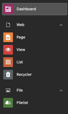
View
You can use this module to display how the individual pages in the frontend look to the website visitor. The display module allows you to view the frontend view without having to leave the backend or open a new page, and you can switch between different formats and sizes, for example to check how the page is displayed when it is called up on a smartphone or tablet. There is no further documentation for this module, as it is self-explanatory and very intuitive to use.
List
In this module, you will find pages, content elements and data records displayed in table form. You can create, edit and delete pages here in the same way as in the Page module. The same is also possible with content elements. In contrast to the Page module, you can also create other data records depending on your user rights. These include, for example, category, news data records or data records for other extensions. In most cases, special folders are created in the page tree that are intended for exactly one type of these data records.
Navigation
The respective navigation of the selected module is displayed in this area. In the Page module, for example, the page tree of the website is displayed. Depending on the rights of the editor, only individual page trees or pages of the website can be displayed here.
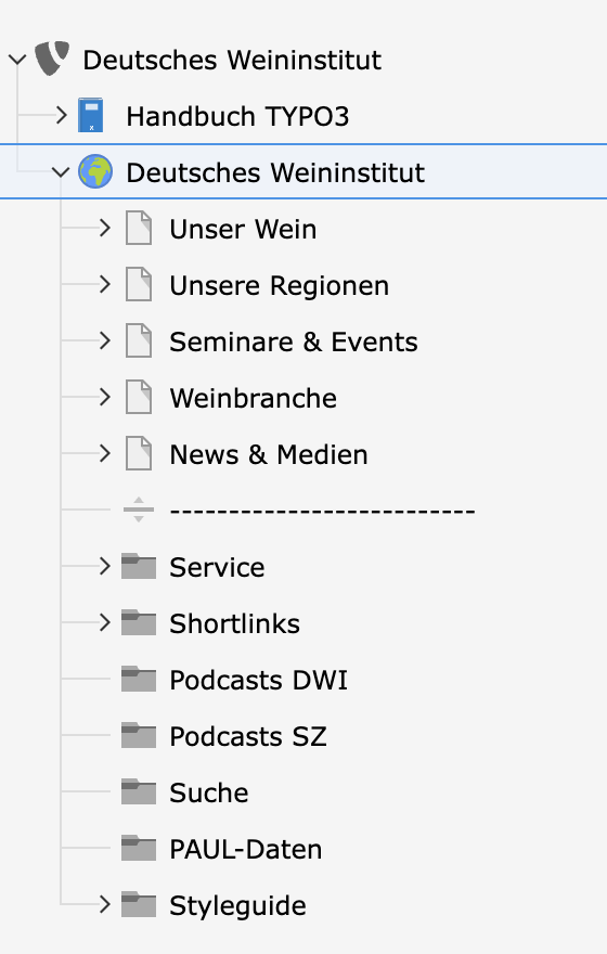
The page tree can be imagined as a tree with branches, which in turn can have branches, which in turn can have branches, etc. At the top is the main page, from which all other pages start. Each page can have several subpages, which in turn can have subpages.
Workspace
Header bar
The header bar provides various functions and information. You can expand and collapse the module view using the tile icon on the left-hand side. When collapsed, only the icons of the respective modules are visible. The area with the TYPO3 logo  shows the name of the website and the TYPO3 version used (in the example image DKFZ Intranet TYPO3 version 11.5.16). On the right-hand side you will find the following functions in the header bar
 Bookmarks that you have already created.
You will find the star symbol on every page in the backend and can create bookmarks by clicking on the icon. Clear cache so that a change to the content elements is also displayed.
 Opened and recently used documents.
 Help with quick access to the editor's manual, style guide and general information on the TYPO3 CMS.
 User name and your user picture
Depending on your user rights, you can open the user settings here by clicking on your name. Search, with which you can search the entire system for pages, content elements, files or data records.
Working with pages
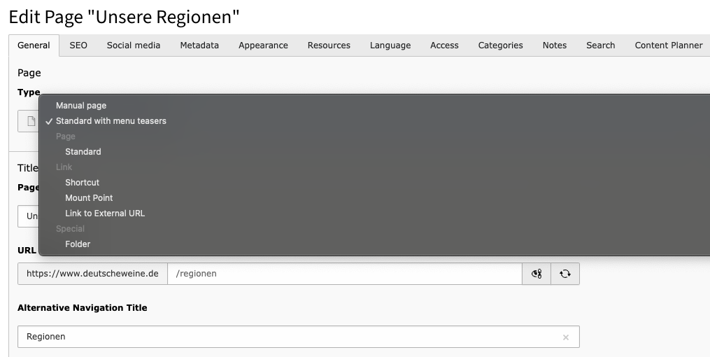
Page types
Different page types are displayed depending on your user rights. In principle, only the standard page is relevant for most editors.
 Wurzel-Seite: Normale Standard Seite, welche den Anfang eines Seitenbaums darstellt.
 Standard: Stellt die normale Standard Seite dar.
 Backend-Benutzerbereich: Wird für Seiten benutzt, die nur im Backend angesehen werden können.
  Verweis: Beinhaltet einen Link/Verweis auf eine andere, interne Seite.
 Einstiegspunkt: Verweist ebenso wie der Verweis auf eine andere Seite.
 Link zu externer URL: Wird benutzt, um einen Verweis/Link auf eine externe Seite hinzuzufügen.
 Ordner: Wird benutzt, um Datensätze abzulegen (z.B. Artikel Datensätze).
 Papierkorb: Kann als Ablagestelle für Datensätze und für Seiten, die nicht mehr genutzt werden, aber noch nicht gelöscht werden sollen gebraucht werden.
 Trennzeichen für Menü: Wird häufig zur optischen Strukturierung des Seitenbaums genutzt. Ansonsten kann es genutzt werden, um ein Trennzeichen in einem Seitenmenü zu repräsentieren.
Symbols in the page tree workspace
 Shows all possible page types.
 Opens a search field in which the page tree can be filtered using a search term.
 Updates the page tree.
Create pages
There are various ways to create a page. The most common ones are described below. Basically, it does not matter which method you use. You can therefore use the method that seems most intuitive to you.
In the Page module
- Click on above the page tree. Click on
 and hold down the mouse button. You can now move to the desired position and insert it.
 - Right-click on a page and select the line with and the caption New label. After you have assigned a name and Save the page is saved to and on the same level as the page on which you right-clicked.
- If you have opened the editing screen of a content element, you can create a new page by clicking on in the top bar. The page is created after and on the same level as the page whose editing form is currently open.
- A new page can be created in the same way by right-clicking on in the path display or below the editing form.
In the List module
- In the table with the pages, click on . You can now click on the arrow to determine the position at which the new page should be created.
- In the menu overview, click on
 . Here you can choose betweenPage (in)which creates a page below the selected page, Page (after)which creates a page after the selected page and Page (select position)where the position of the page in the page tree can be selected manually.
 Create multiple pages
Hide and unhide pages
 Activate
 Move pages in the page tree
To change the order of the pages in the page tree, you can simply move the individual pages using drag & drop. Left-click on the page to be moved and, holding down the mouse button, drag it to the page on or below which the selected page is to be inserted.
If you want to insert the page on the same page level, wait until a line appears. The page is inserted behind or in front of the page on which you release the mouse button.
If you want to move the page down one page level, wait until a blue background appears. The page is then inserted below the page on which you released the mouse button.
Page preview
To view a page as a preview, right-click on the title of the page in the page tree. In the context menu, select  Show. Alternatively, you can select the page in the page tree and then click the button in the top left-hand corner of the workspace.
A new browser tab opens and a preview of the page is loaded.
Delete page
Page properties
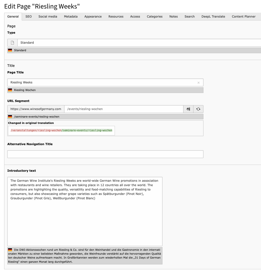
Symbols for the editing form
It is not the content of the page that is edited in the page properties, but additional information such as the page title.
You can access the page properties by right-clicking in the page tree in the drop-down menu on  Edit in the page tree or when you are in the page module on the page to be edited: Click on above the content area.
- If the website offers several language variants, the language (German or English) in which the content element is to be edited can be selected in the drop-down menu at the top left.
 Close: Closes the page form.
 Save: Saves the current page form version.
 Show: Opens the selected page in a new window in the frontend.
- New: Enables the creation of a new page ( see Creating a new page ).
 Delete: Deletes the current page. - Open: Opens the editing form in a new window.
 Share:
 : Creates a bookmark on the open form.
- Copies the URL of this page
 : Displays a short help text on the meaning of the respective form.
You can make various settings in the page form. The page form is divided into several tabs. Which tabs you can see and edit depends on your user rights.
Menu teaser
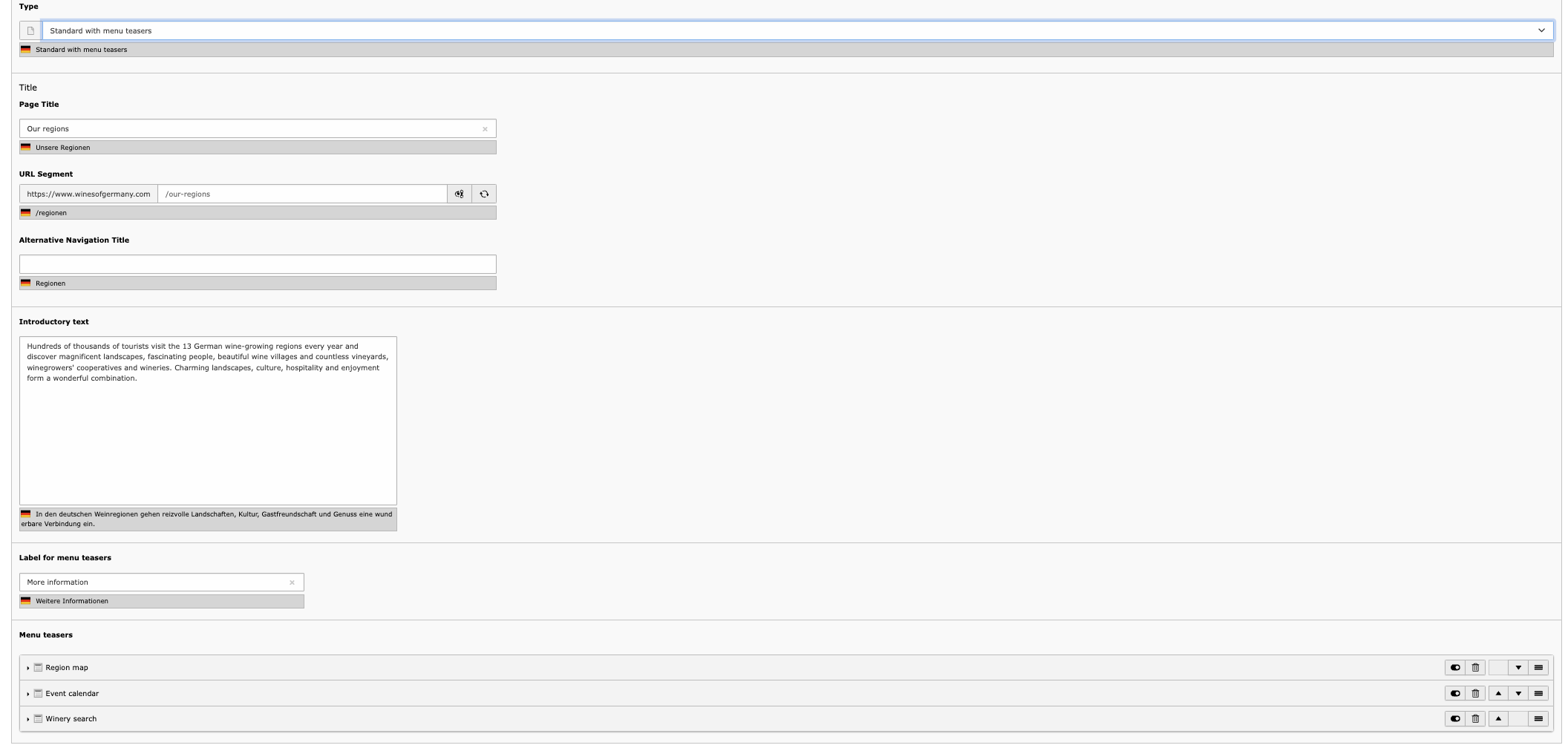
It is possible that the menu teasers are given a headlines, such as "More information"
A maximum of 3 menu teasers can be created. These elements can be deactivated, deleted and moved in sequence.
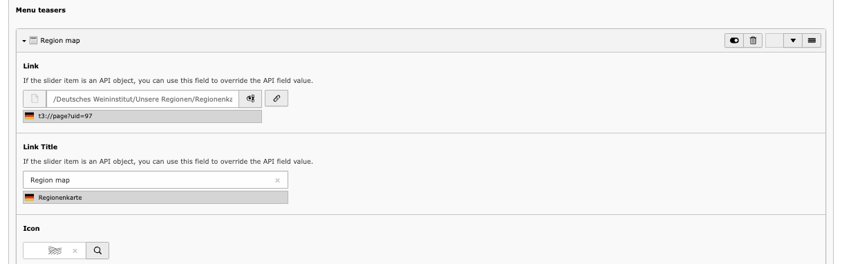
With a link you refer either to a page or directly to a content element on a page.
You can use the title to provide further information on where the link leads to.
Each teaser should have an icon and you can choose from a portfolio of icons that are currently used throughout the website.
Working with content elements
What is a content element?
A content element is a unit in the backend of a TYPO3 page that contains content of a certain type and whose visual appearance is defined. A single page can consist of several content elements (e.g. text & media, accordion, link list).
Symbols in the content area
- : Displays the current pages in the frontend
- : Opens the page properties form
- : Clears the cache of the currently selected pages
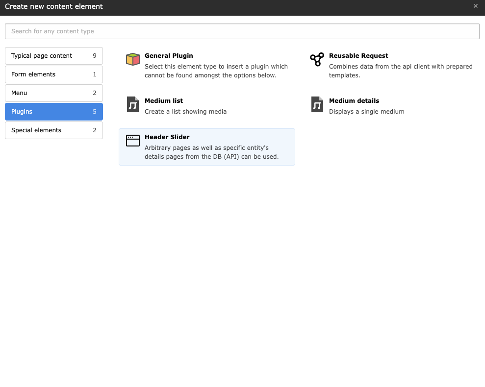
Add content elements
Content elements have several fields that can be edited. The fields are used to configure the content element and to fill it with text and images in order to achieve the desired output in the frontend.
To create content elements, select the module Web  page module in the module guide. In the page tree, navigate to the page on which you want to create the content element. The workspace displays the structural layout with any existing content elements.
Select the area where you would like to insert the content element by clicking on Content there. Depending on the selected area and user rights, you can now choose between different content elements. There are usually various tabs in which content elements of different types are displayed (including typical page content and containers). Click on the content element that you would like to insert. This opens the input form in which, for example, headings, text and images can be inserted.
Copy content elements
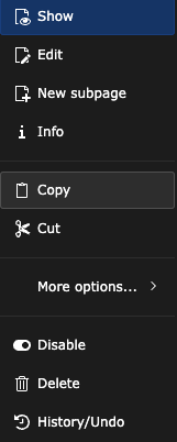
If a content element is copied and pasted to a new position, this new content element is completely independent of its original element. This means that there are no effects on the copy if the original element is adapted. This also applies vice versa. Right-click on the respective icon for a content element. This opens the context menu.
Select the option  Copy here. You can insert this copied element on any page at the desired position. To do this, switch to the position where the copy is to be inserted. Click on
  and confirm the query in the dialogue by clicking on the Paste button.
Cut out content elements
Right-click on the respective icon for a content element. To cut the element, click on  Cut in the context menu that opens. You can insert the cut element on any page at the desired position. Click on to insert the content element.
Hide content elements
Right-click on the respective icon for a content element. To hide the content element in the frontend, click on  Deactivate in the context menu.
Delete content elements
Right-click on the respective icon for a content element. To delete the content element, click in the context menu on Delete. Then confirm the enquiry by clicking on the Delete button.
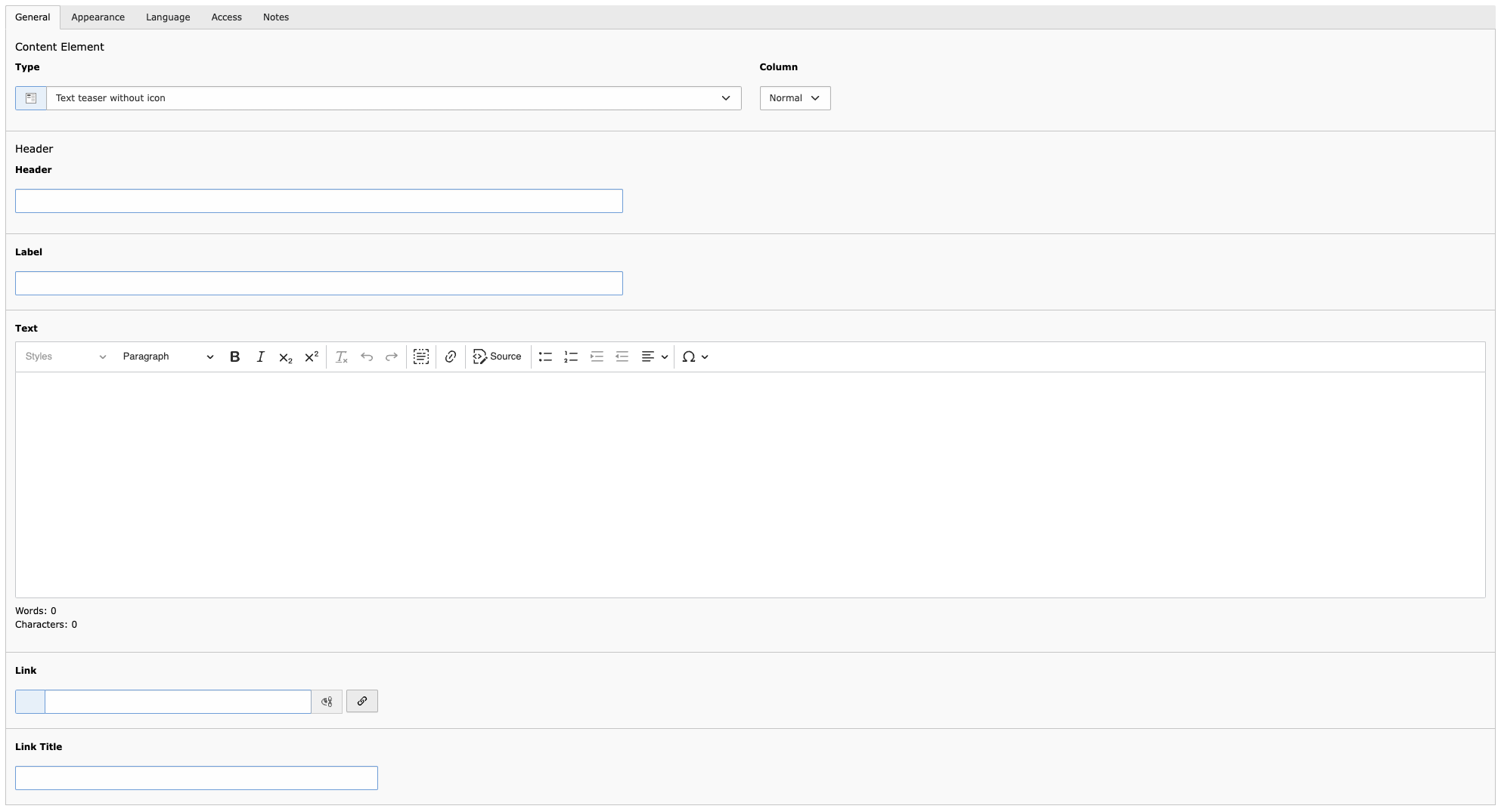
Text & Media
The "Text & Media" element is the most frequently used content element and is a versatile tool for designing your website. In the "Text & Media" content element, you can add images or videos to your page in addition to text.
The Rich Text Editor (RTE) is available to you for creating content, with an interface similar to that of familiar word processing programmes. You can find the editor in the "Text & Media" content element in the "General" tab, for example.
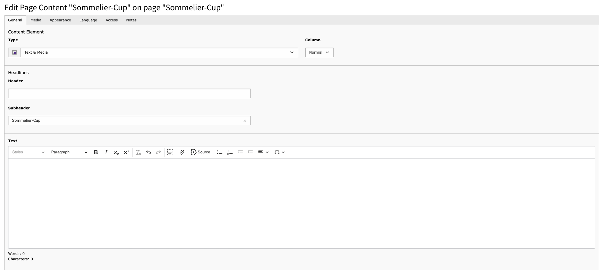
Each content element has exactly one heading. If required, an umbrella line can also be added, which appears above the heading.
Additional headlines can be formatted in the text field. Use this field to define the hierarchy level (H2-H5) of the headline.
The text can be broken up using bold, italics or bullet points.
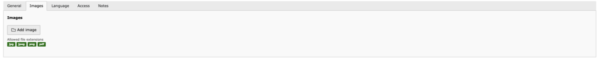
Add image
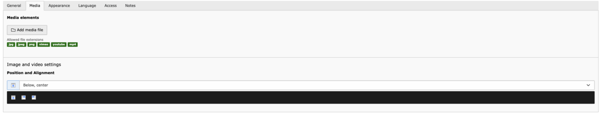
Under the Media heading, you can add an image by clicking on the Add media file button. Then select the corresponding folder from the directory tree and click on the desired media file.
Metadata for the image is maintained directly on the file in the file list and read out automatically. However, these properties can be overwritten in the content element itself if required.
Further editing of the image is carried out directly in TYPO3 using the image editor. You can freely define the section of the image and select one of the predefined aspect ratios. Click on "Accept" to finalise the editing. The original image will not be changed.
The image format 3:2 is selected for this content element. In the Media tab, you can also determine the position of the image in relation to the text element. The following positions are possible for this element:
- Image next to the text on the left
- Image next to the text on the right
- Image bottom centre
The different positioning of the images is shown in the style guide.
Accordion
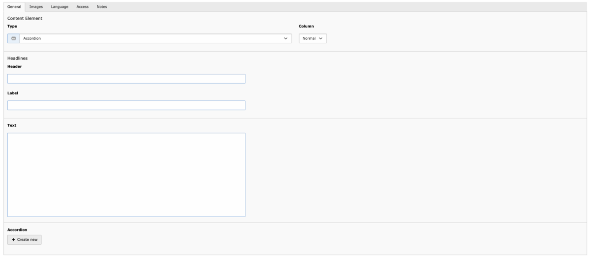
The accordion is ideal for presenting information in a structured and clear manner.
Firstly, you can add a heading and, if required, a header (label: appears above the heading). Text can also be added.
A picture can be added to the entire accordion.
You can add an image under the Media heading by clicking on the Add media file button. Then select the corresponding folder from the directory tree and click on the desired media file. Further editing of the image is done using the image editor. The image editor allows you to customise the image directly in the TYPO3 backend.
Create accordion entries
Any number of entries can be created within the accordion
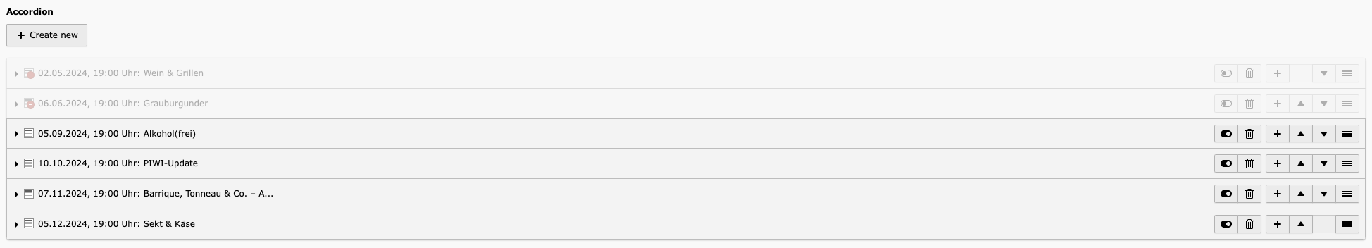
Create new accordion entries
The entries can be activated and deactivated, deleted, a new entry can be created directly after an entry (+) or positioned up or down using the arrows. The horizontal lines can also be used to move the entry to a different position.
Fill accordion entry with information
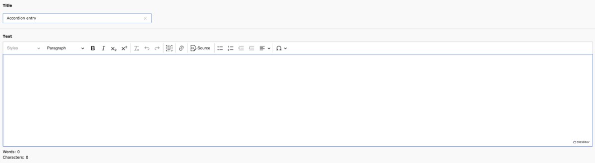
Similar to the Text & Media content element, texts can be formatted using the Rich Text Editor (RTE).
- Headings (h2-h5) can be inserted
- bold
- italicised
- superscript or subscript
- select everything
- linking
- bulleted list
- numbered list
- Positioning of the text, such as left-aligned etc.
- special characters
Text teaser without icon
Link list
The link list distinguishes between
- Internal links (redirect within your own site)
- External links (redirect outside the DWI)
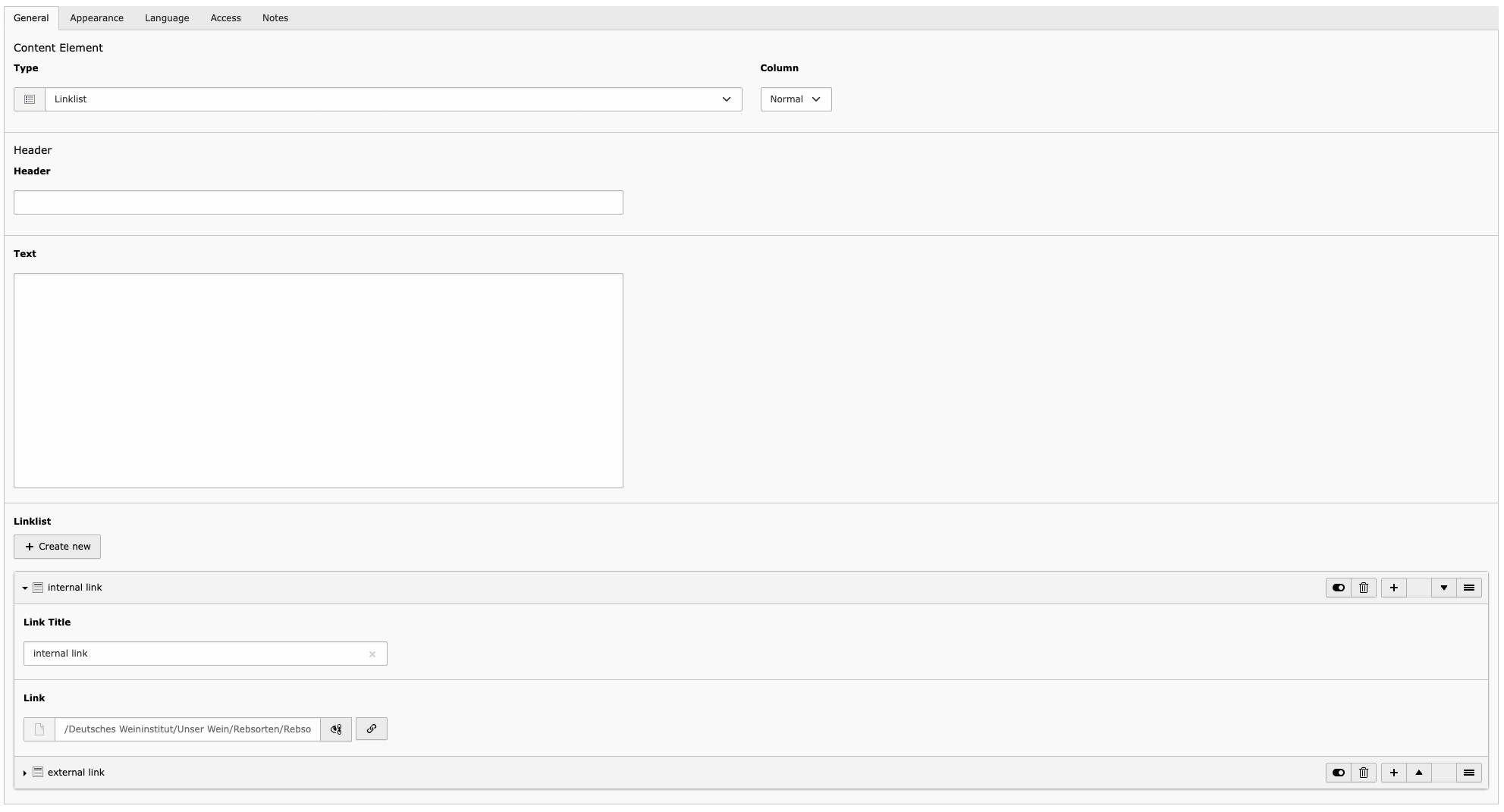
A heading can be assigned.
Further information can be added to the link list.
Any number of links can be created. Each link can have a separate title and then the URL or the page or an element on a page to which the link is to be made must be specified via a selection window.
The links can also be activated and deactivated or deleted. The order of the links can also be changed.
List of downloads/materials

An optional headline can be specified.
Further information on the list can optionally be entered.
The materials to be made available for download must first be uploaded via the file list module. Images (jpg. png) and documents (pdf) can be linked. A title can be stored for each link.
Facts module
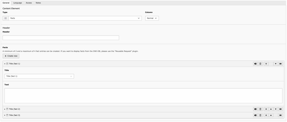
The facts module is used to present data briefly and concisely.
The heading of the facts module is not displayed in the frontend.
A minimum of 2 and a maximum of 4 fact entries can be created. If you would like to display facts from the DWI-DB, please use the "Reusable Request" plugin.
The title of the fact is displayed larger than the description (text).
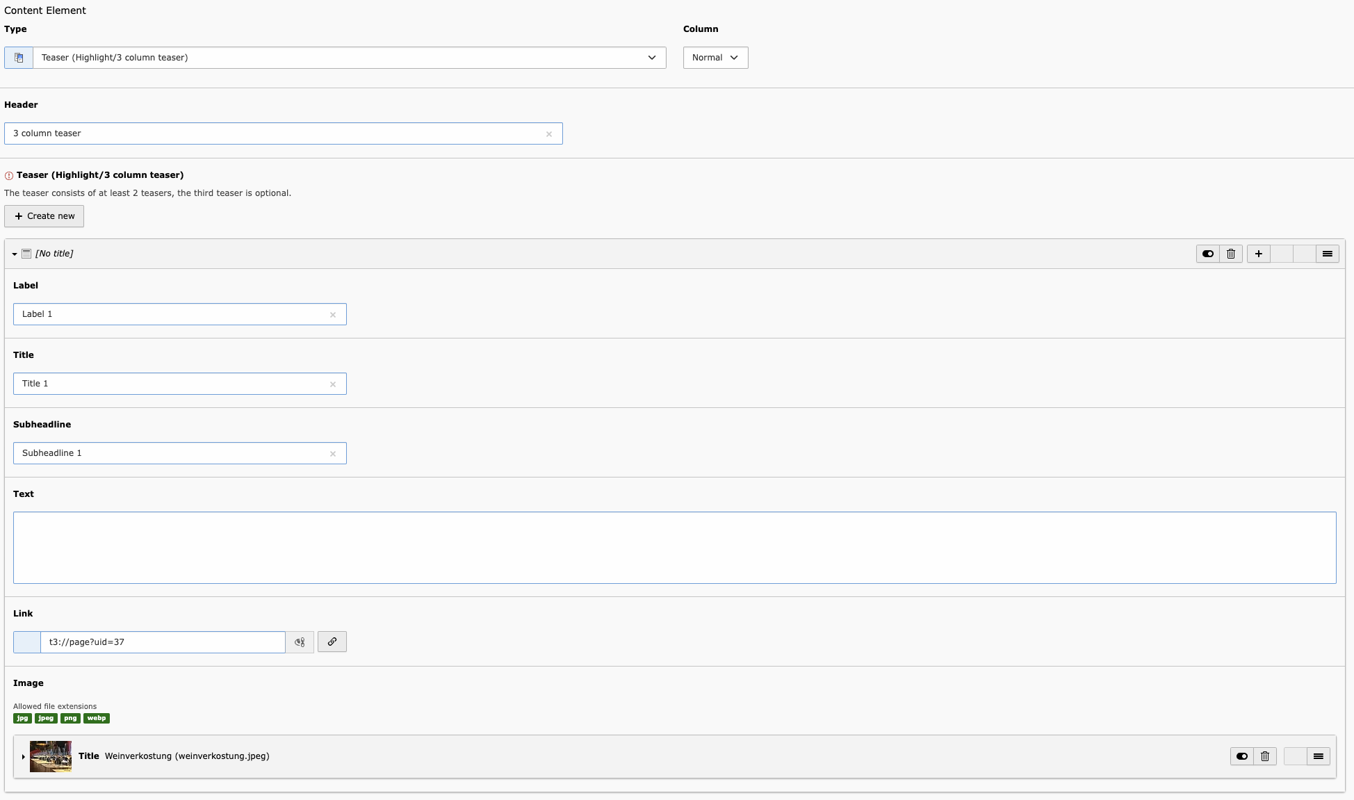
Teaser
Highlight teaser
You can find an illustration and use of the highlight teaser in the style guide.
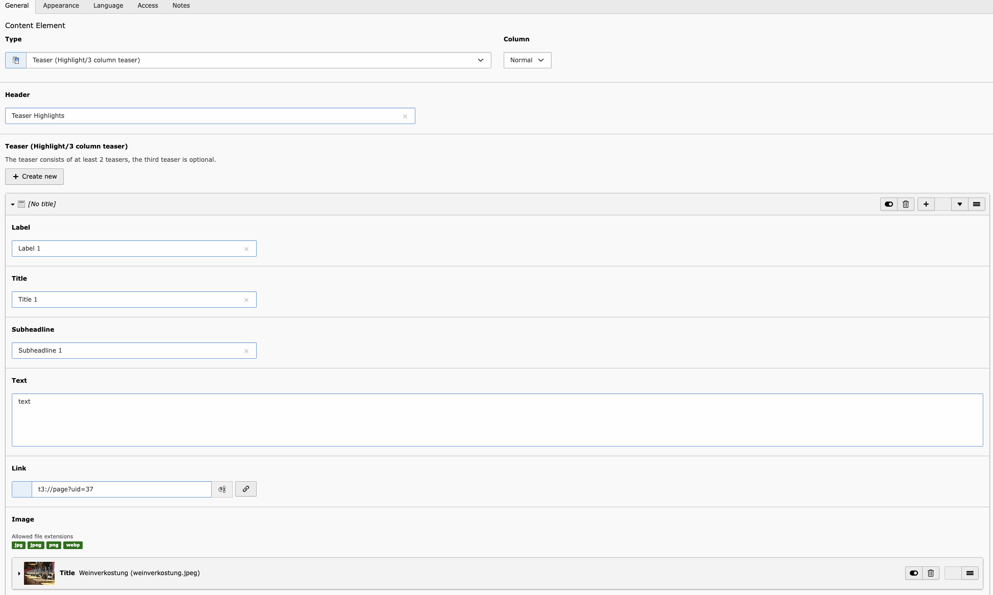
The headline is not displayed in the frontend.
An kicker can be added to the teaser, which appears above the headline. The title is the headline and further information can be added as a subheading.
A text field is available for further information. A link must also be entered in order to be redirected to the page. An image can also be added.
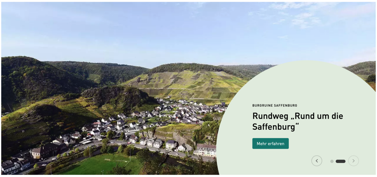
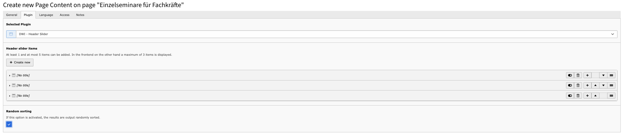
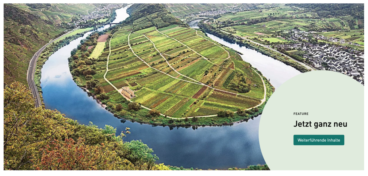
Stage slider
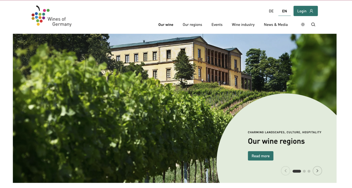
The big slider serves as a start page entry element to enable current jumps to other content on the page.
A distinction is made between static and dynamic content. The static content is completely maintained editorially in TYPO3 and can be customised in this system as required.
The dynamic content comes from the DWI-DB content pool via the API interface. Existing data is selected here and presented as a stage slider entry.
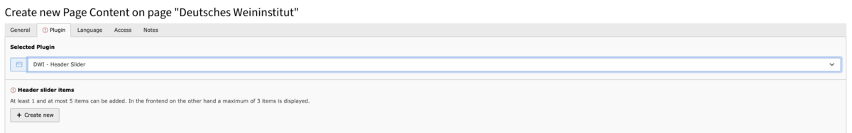
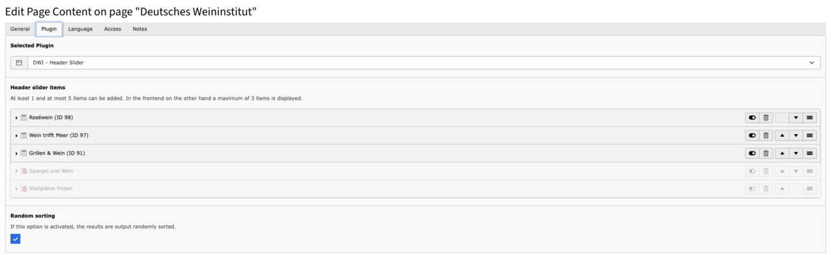
There is also the option of "random orientation": If this option is activated, the results are output in random order.
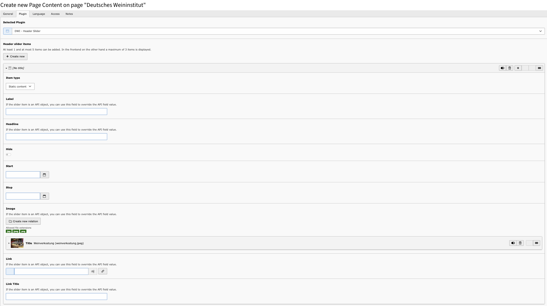
Selection as "Static content"
Definition of the various attributes for the entry.
Content from the DWI-DB
For the dynamic data from the DWI-DB, the entry type "Content from the DWI-DB" is selected in order to obtain the existing data via the API interface and, if necessary, to adapt it editorially.
The concepts for the API client of the DWI-DB are described in detail under t3://page?uid=220.
The integration of a wine view as a stage slider is documented below.
To display a single data record from the DWI-DB, we need the ID of the wine view. This allows us to configure the query in TYPO3 accordingly.
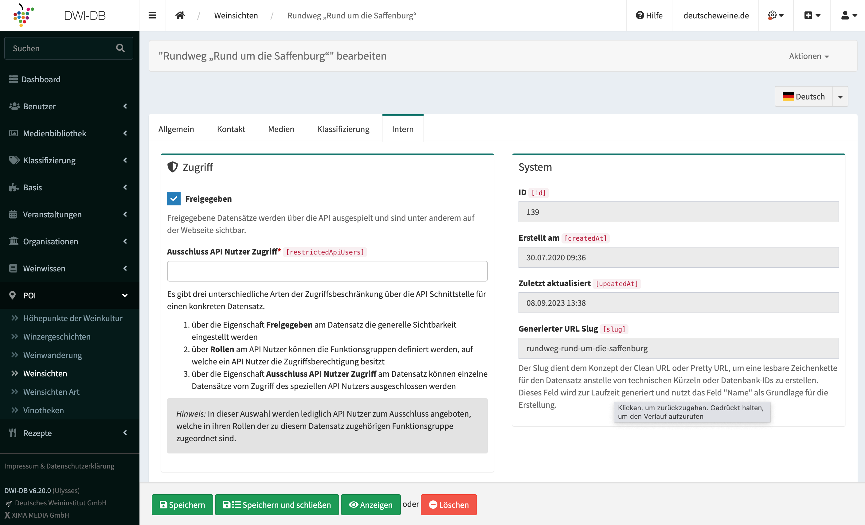
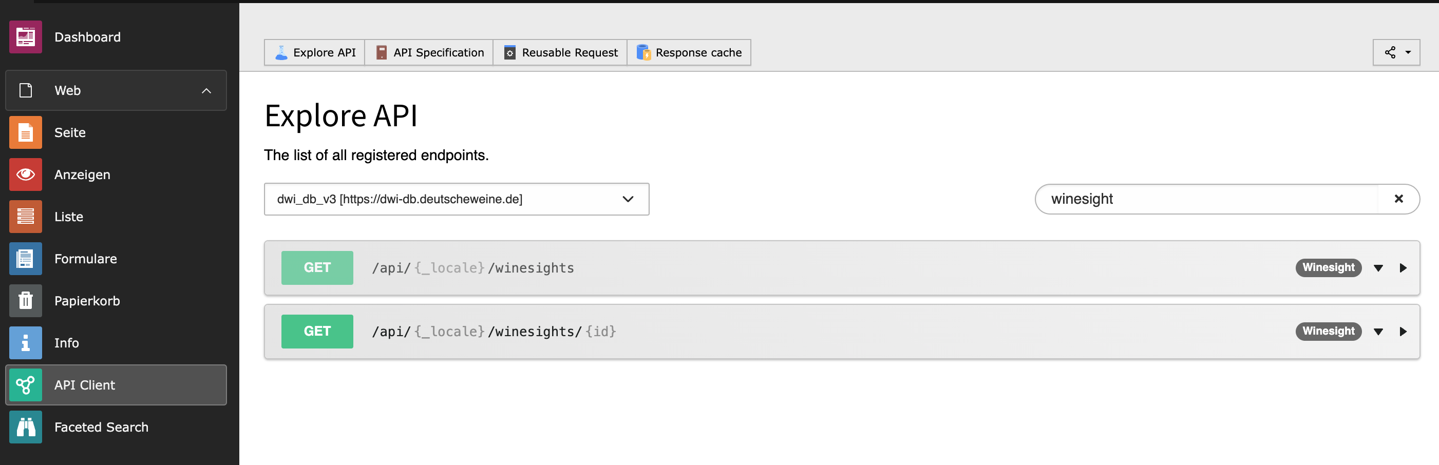
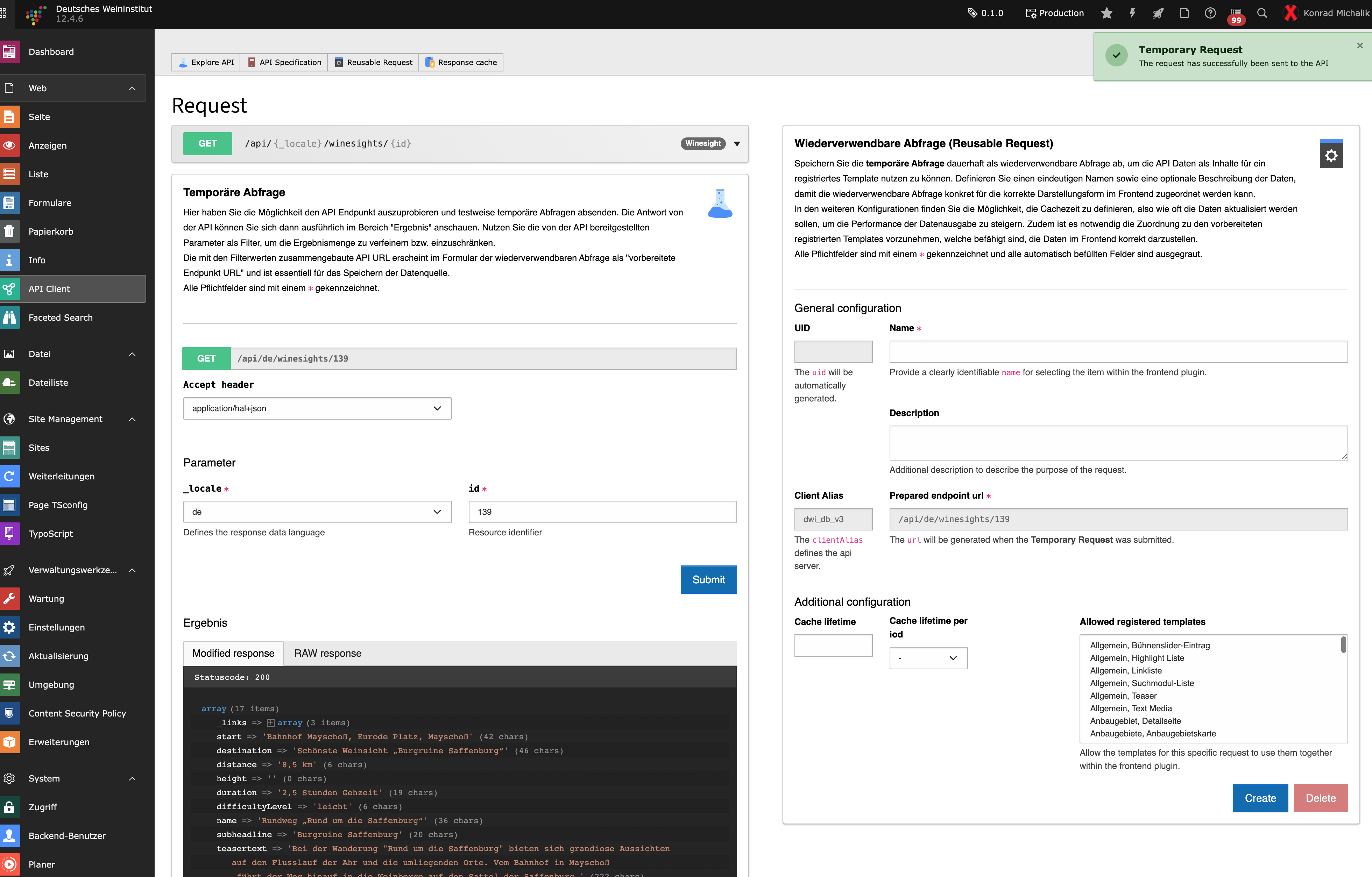
The ID from the DWI-DB is entered as the filter value.
The prepared query is sent as a test as a temporary query.
The API data can be viewed under "Result".a
By sending the temporary query, the endpoint URL was assembled and updated.
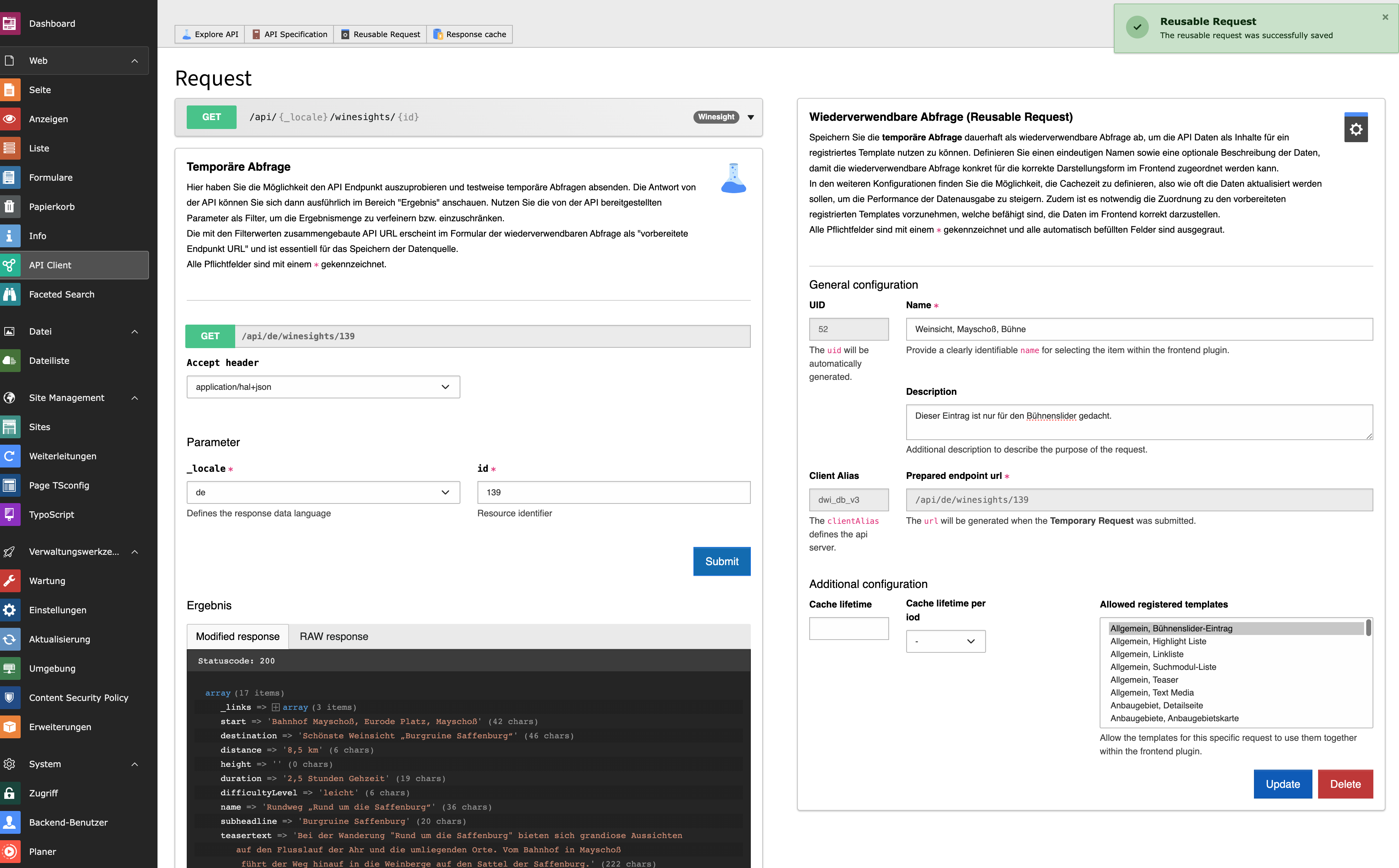
Name and description for recognizing the entry.
The "General slider entry" template must be selected here so that the query is also permitted in the slider.
The reusable query is saved.
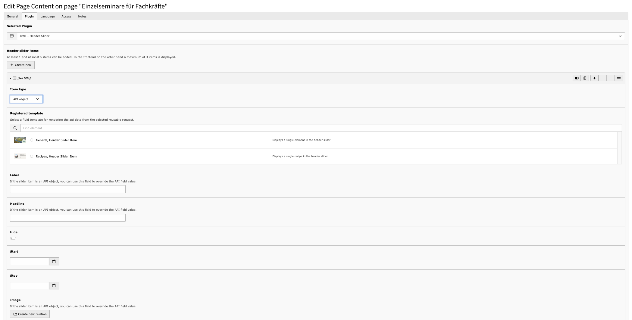
To display data from the DWI-DB in the stage slider, the type "Content from the DWI-DB" must be selected here.
The template "General slider entry" is used here to display the data from the DWI database.
Optionally, all attributes that are dynamically filled with data from the DWI database can be overwritten in the lower part of the plug-in. This makes it possible to adjust individual components editorially, for example to provide seasonal information.